Border Image
Creating the artwork
So the first step in making the border-image properties to work properly is trimming the artwork. This means removing any excess pixels outside the border artwork. In Photoshop use the trim command, under the Edit menu.
In Illustrator this is less obvious though not difficult when you know how. There are two ways either exporting the single image using Asset Export or the whole artboard. The first way you just select and drag the artwork to the Asset Export and click the Export for Screens icon at the bottom.
To export an artboard:
- Select your artwork by clicking on it.
- Next double click the artboard tool (press
shft + oif you can’t see it). - Then in the preset drop down box choose Fit to Selected Art
Images can be exported typically as PNG’s or SVG’s though SVG’s tend to be much smaller unless you have a particularly complicated or ornate border.
Do you need a regular border?
Although you shouldn’t need to use a regular border declaration for border-image to work currently some browsers (Chrome to at least version 102) require this. So a simple border: solid 3px black; is all that’s needed for border-image to work.
With that fixed border-image will work on a wide variety of browsers, even IE 11.
The border-image properties
The CSS border-image property is shorthand for the following properties:
border-image-source: url(img/some-image.png)the image url or use a gradientborder-image-slice: 30pxsets the size of the slices of a background image. See MDN.border-image-repeat: repeat | round | space | stretchis how the border image is repeated. Can also take two comma separated values for X and Y axes.border-image-width: 2emthe width of the borderborder-image-outset: 10pxcan push the border outwards or inwards with a negative value
| property | description |
|---|---|
border-image-source |
The source can be either an image or a linear-gradient or repeating-linear-gradient and the syntax is the same as for background-image. Examplesborder-image-source: url(images/some-image.png)border-image-source: linear-gradient(to bottom left, blue, pink) |
1. border-image-source
The source can be either
- the url of an image,
- a
linear-gradient - or
repeating-linear-gradient
The syntax is the same as for background-image.
Examples
border-image-source: url(images/some-image.png)
border-image-source: linear-gradient(to bottom left, blue, pink)
This box has only 3 of these properties:
.pink-blue {
    border-image-source: linear-gradient(blue, fuchsia);
    border-image-width: 2em;
    border-image-slice: 30;
}
NB. Without border-image-slice in this gradient border you just get the gradient in the four corners.
2. border-image-slice
This is a key value to get the border to work as it should. The image is split into 9 different sections: 4 corners, 4 edges and the middle. The middle slice is empty unless the keyword fill is added to the border-image-slice declaration.
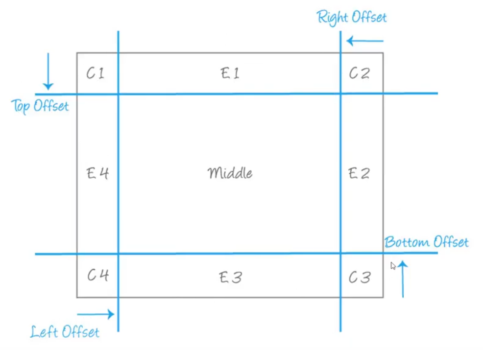
The size of these offsets for most borders is all the same so just one value will do.
The value can be either unitless, eg. border-image-slice: 30 or a percentage. The unitless value is in pixels for raster images and coordinates for vectors, though vectors relate to the source image rather than the border as drawn on the page. So percentages are best for vector images.
See MDN for more…
MDN Border Image Generator
Is a great tool for creating CSS border code. You can upload an image or load one from a url and tweak various border-image properties and see exactly what they do. Then just cut’n’paste the CSS it spits out at the bottom. Demonstrated in a Kevin Powell video.
Video
View the CSS for this page
td:first-child {
    white-space: nowrap;
}
.bbox {
    display: grid;
    place-content: center;
    width: 400px;
    aspect-ratio: 16 / 9;
    background-color: #1114;
    float: right;
    transition: all 0.7s;
}
.bbox span {
    transition: all 0.7s;
    opacity: 0;
    font-size: 0.85em;
}
.pink-blue {
    border-image-source:
    linear-gradient( blue, fuchsia);
    border-image-width: 2em;
    border-image-slice: 30;
}

.pink-blue:hover {
    border-image-outset: 60px;
}
.pink-blue:hover span {
    opacity: 1;
}